Elegance at every inch.
Branding of this venture had to effectively communicate the collaboration of two individual companies from India and China. Additionally reflecting the core of the company.
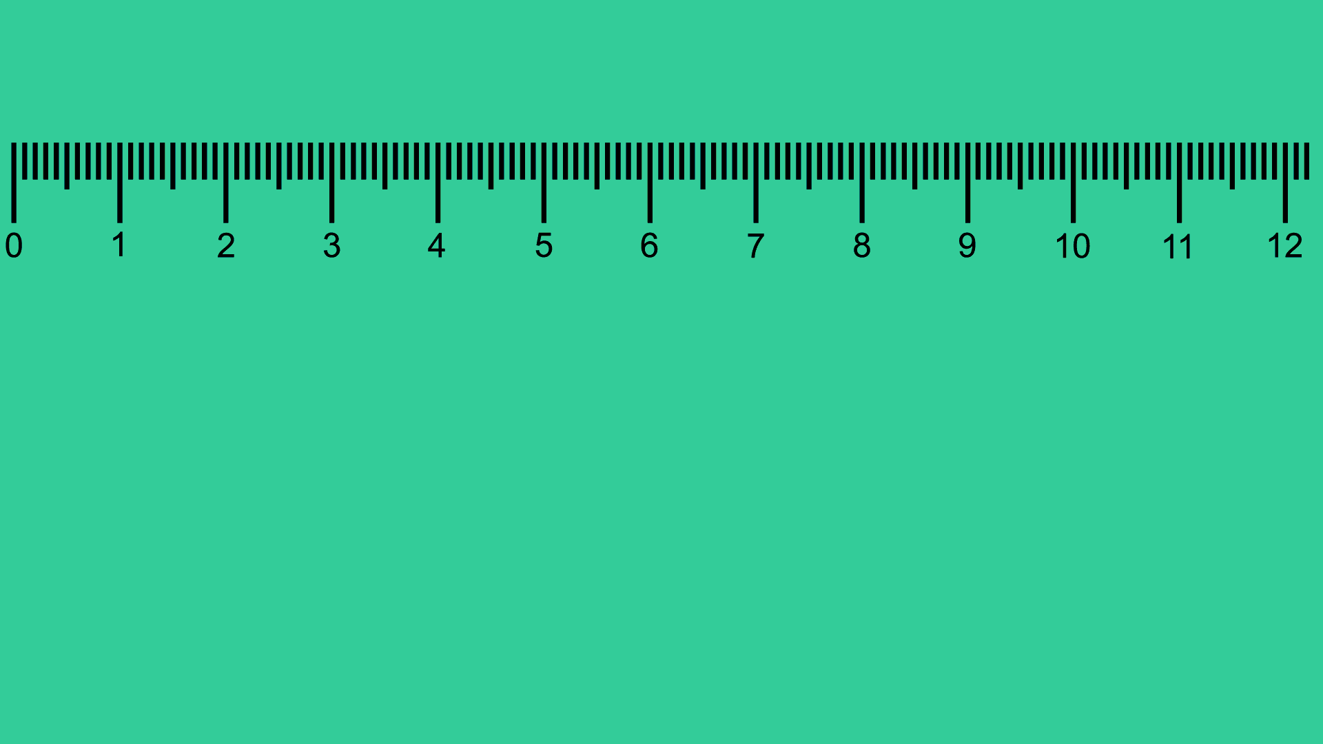
On the pursuit of cracking a brand name that serves the purpose of constructively communicating the collaboration and the purpose, we squared down to using the first two letters from the two names, “India” and “China”, which also described the unit for dimensions.
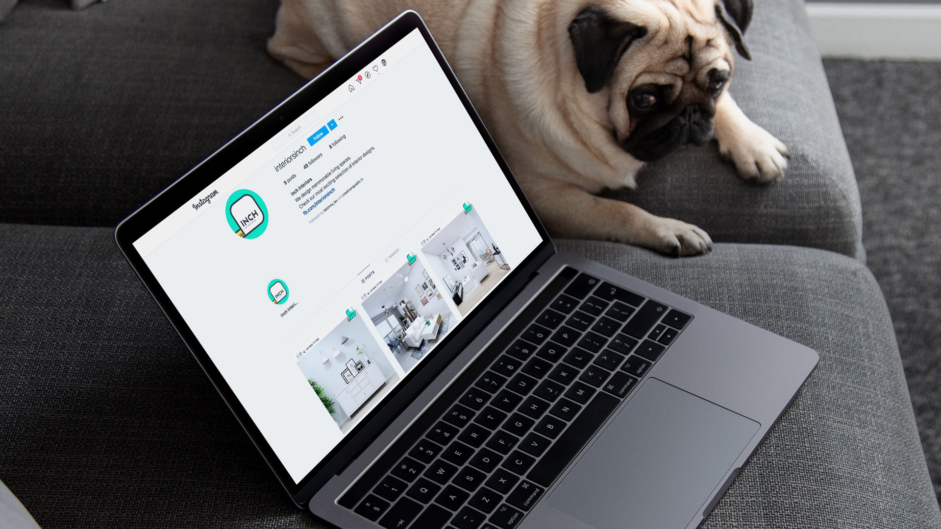
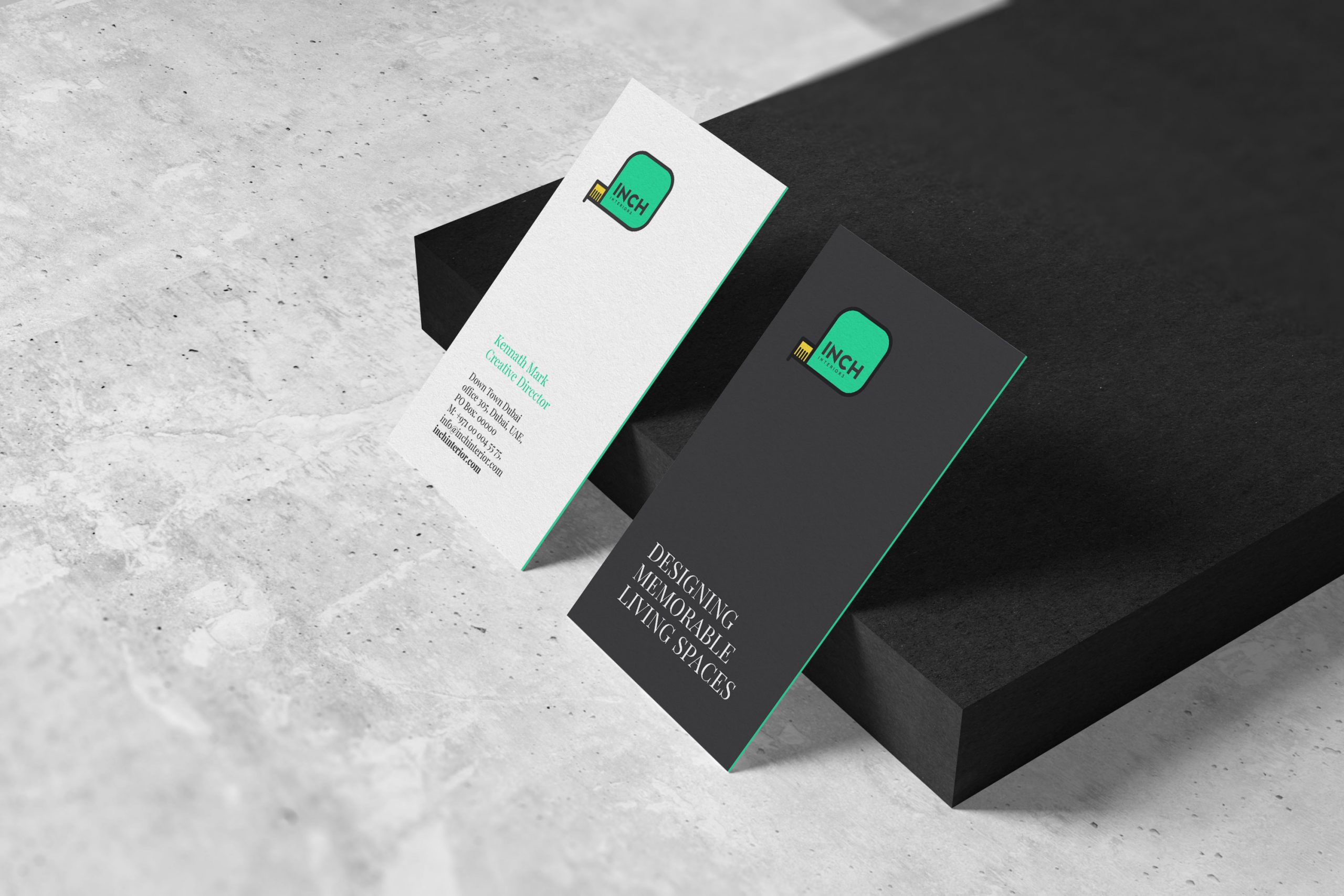
“Inch Interiors”. The brand logo design was based on the measuring tape, a pivotal element used in the field of interior design. This enabled an instant connection of the consumer to the core of the brand.

We’re always open to share ideas, get in touch with us. Let’s build it together.

